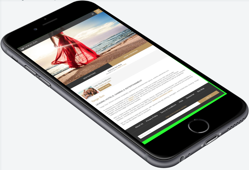
I'm trying to create responsive layout for my project where i have png image as a background and jpg screenshot for screen area. Example on JSFiddle. I've created matrix3D transformation here using fixed image sizes for background and screenshot images. As you can see — image perfectly aligned and transform-origin set to 0 and this transformation applied:
transform: matrix3d( 0.642387, -0.289132, 0, 0.000087, 0.456665, 0.32747, 0, -0.000096, 0, 0, 1, 0, 88, 256, 0, 1);

Now i'm trying to make it responsive to screen width but i can't figured it out to how fix incorrect proportions on smaller screen size or any other than close to original one (try to resize the JSFiddle window) that was used to create matrix3d transformation.
Looks like matrix3d linked to element dimensions in pixels or maybe i'm wrong.
UPDATE #1:
I have some progress here by trying to eliminate translate part from matrix3d. I've moved transform-origin to 50% 50% too to make sure that all transformations applied in same way from the center of the image. Here is the updated toolkit state and new JSFiddle example. Still not perfect.
UPDATE #2:
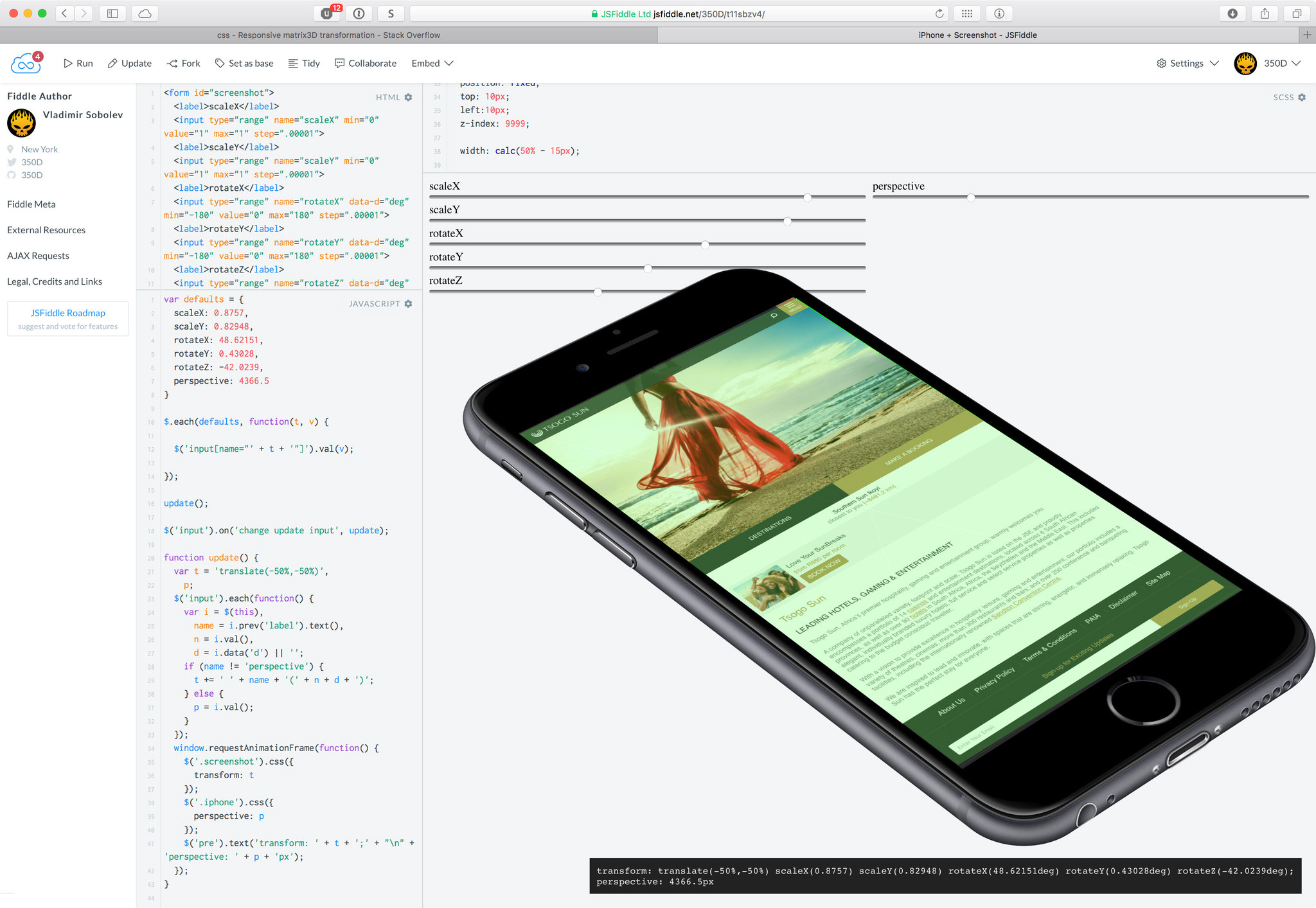
I've created simple UI to control all rotate/scale transformation here on JSFiddle and recropped iPhone image to make sure that center of the green screen (you can see cross lines in the middle) is in the same location as a screenshot center; Now i have more controls and more predictable results but still have problems with resizing.
Aucun commentaire:
Enregistrer un commentaire